Here is a situation most HR leaders in India will recognise. The CFO asks you to justify the wellness program budget at the annual review. You have a beautifully designed brochure about yoga sessions, mental health webinars, and step-count challenges. You have glowing employee testimonials. What you do not have — what almost nobody has — are numbers that a finance team will actually respect.
That is the gap this article closes.
Measuring employee wellbeing is not complicated, but most organizations make it harder than it needs to be. They either track too many things and drown in data, or they track the wrong things entirely — satisfaction scores and attendance at wellness events — and wonder why leadership treats wellness as a discretionary line item rather than a business investment.
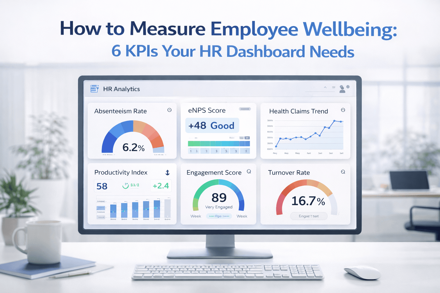
There are six KPIs that cover the full measurement picture: from early warning signals you can catch months before a crisis, to hard financial outcomes that show up on the balance sheet. Together they form a dashboard that any CHRO can walk into a boardroom with, and any CFO will understand. Here is how to build it.
Why Most Wellness Programs Fail to Prove Their Value
A 2023 study found that over 70% of Indian corporates have some form of employee wellness initiative, yet fewer than one in five can demonstrate ROI in financial terms. The programs are not necessarily failing — the measurement frameworks are.
The fundamental problem is timing. HR teams tend to measure outputs — how many employees attended a session, how many downloaded the wellness app — rather than outcomes: did health actually improve, did costs actually fall, did people actually stay? Outputs are easy to count and satisfying to report. Outcomes take longer to appear and require more discipline to track. But they are the only numbers that matter in a budget conversation.
You cannot improve what you do not measure. But more importantly, you cannot defend what you cannot prove. That is a lesson most HR teams learn too late in budget season.
The six KPIs below are outcome measures. Some are leading indicators that show where health risk is building before it becomes a crisis. Others are lagging indicators that confirm your program is working over time. You need both.
KPI 1: Absenteeism Rate
Absenteeism is the closest thing wellness has to a real-time vital sign. When employees are physically or mentally unwell, they stop showing up. The pattern almost always appears in absenteeism data before it surfaces anywhere else — before turnover spikes, before healthcare claims rise, before engagement scores fall.
How to Calculate It
Formula
(Total unplanned absence days / (Number of employees x Available workdays)) x 100
Benchmark
1.5% to 2.5% for high-performing Indian organizations. Industry average: 2.8% to 3.4%.
Frequency
Monthly, segmented by department
What Good Looks Like in Practice
A mid-sized IT services company in Pune noticed that one department consistently ran an absenteeism rate of 4.2%, while the rest of the organization averaged 2.1%. The difference was invisible in company-wide dashboards but stood out immediately once they broke the data down by team.
Digging deeper, they found the outlier department had a newly promoted manager with no people-management training, a project running six months over schedule, and no structured way for employees to flag burnout. The wellness program had nothing to do with the problem — but the data pointed them straight to the cause.
That is the value of tracking absenteeism at department level rather than company-wide. A department running above 3.5% is almost always signalling something specific: overloaded workload, a difficult manager dynamic, or a team that has been running on fumes for too long. The number does not tell you what is wrong — but it tells you exactly where to look.
• Track monthly, not quarterly. Monthly data shows trends early enough to act on.
• Separate unplanned absences from planned leave. Only unplanned absences belong in this KPI.
• Flag any department above 3.5% for a structured conversation with the line manager within 30 days.
KPI 2: Employee Net Promoter Score (eNPS)
The Net Promoter Score was originally designed for customer loyalty, but its adaptation for employee experience has become one of the most reliable pulse-checks available to HR. It asks one question and produces a number that leadership instinctively understands because they already track NPS for customers. That familiarity is a feature, not a coincidence.
How to Calculate It
Formula
Ask: 'On a scale of 0 to 10, how likely are you to recommend this company as a place to work?' Promoters = 9-10. Detractors = 0-6. eNPS = % Promoters minus % Detractors.
Benchmark
+20 to +30 is strong for Indian corporates. Scores below 0 indicate serious cultural problems.
Frequency
Quarterly — never annual-only
The Annual Survey Problem
Most organizations run their engagement or eNPS surveys once a year. That decision might be the single most expensive mistake in their measurement framework. Annual surveys create an annual lag. If scores drop significantly in February, you will not find out until December. By then, the people who were planning to leave have left, the managers who were burning out their teams have done most of the damage, and whatever intervention you design arrives a year too late.
Quarterly eNPS gives you a three-month feedback loop. It is short enough to catch problems before they compound, and long enough that employees do not feel surveyed into exhaustion. Keep the survey to one question. Add one open-ended follow-up — 'What is the main reason for your score?' — and you will have more actionable data than most annual survey processes ever deliver.
One BFSI company in Mumbai switched from annual engagement surveys to quarterly eNPS in 2022. By Q3 of that year, they had identified a cluster of Detractors in their operations team that pointed directly to a compensation benchmarking gap. They fixed it. The following quarter, that team's eNPS moved from -14 to +8. A full-year process would not have surfaced the problem until after most of the affected employees had already made their decision.
eNPS is not a comprehensive engagement diagnostic — you will need a full validated survey for that. But as a fast, lightweight indicator of directional change in employee sentiment, it is hard to beat.
KPI 3: Healthcare Claims Frequency
This is the KPI that CFOs pay the closest attention to, and the one HR teams are least likely to be tracking systematically. Healthcare claims are not just a cost — they are a leading indicator of where health risk is concentrating in your workforce, typically 12 to 18 months before that risk shows up in insurance premium renewals.
How to Calculate It
Formula
Total claims per 100 employees per quarter, segmented by claim type.
Benchmark
Establish your own baseline in the first two quarters. A rising trend is the warning signal, not any absolute number.
Frequency
Quarterly, segmented by claim category
What the Segments Tell You
The total claims number matters less than what it is made up of. When you break claims down by type, you get a map of the specific health risks your workforce is carrying — and specific interventions follow naturally from each category.
• Stress and mental health claims: Indicator of workload, culture, or management issues. A rising trend here warrants investigation into working hours, manager training, and psychological safety.
• Musculoskeletal claims: Often ergonomic in origin — desk setup, commute patterns, sedentary work. Addressable through targeted physical wellness initiatives and ergonomics audits.
• Metabolic claims (diabetes, hypertension): Lifestyle-driven and slow-moving. These respond well to sustained nutrition and physical activity programs over 12 to 24 months.
• Cardiovascular claims: The most serious category. A rising trend demands both wellness intervention and a frank conversation with your insurance partner about population health management.
A manufacturing company in Chennai found that musculoskeletal claims in their production floor teams were running at nearly three times the rate of office-based employees. That single data point drove a targeted ergonomics review and a six-month physiotherapy access program — interventions that would not have been considered without the segmented claims data to justify the investment.
KPI 4: Productivity Index
Productivity is where many wellness programs make their biggest strategic mistake. They reach for a generic or industry-standard productivity measure rather than one tailored to how their business actually creates value. That approach almost always produces results that are impossible to interpret or defend, because 'productivity' means something different in a call centre than in a software development team than on a factory floor.
How to Calculate It
Formula
Define for your business: revenue per FTE, tickets resolved per employee, units produced per hour, or output per project. Consistency of measurement matters more than the specific metric.
Benchmark
Establish a baseline before your wellness program launches. Target: improvement in high-participation departments vs. low-participation departments over 12 to 18 months.
Frequency
Quarterly
The Baseline Problem — and How to Solve It
If you launched your wellness program six months ago and never set a productivity baseline, you have a problem — but not an unsolvable one. You can still build a comparison framework using wellness program participation as your segmenting variable. Departments with high participation rates versus departments with low participation rates. That internal comparison is nearly as useful as a pre/post baseline, and it is available to you right now using data you already have.
For organizations yet to launch: measure productivity first, for at least two quarters, before you activate the program. That baseline is your single most powerful data asset for every future ROI conversation. Do not skip it to move faster on program delivery.
An IT services company tracked ticket resolution rate per analyst before and after introducing a mental health and physical wellness program for their support teams. After 12 months, analysts in high-participation teams showed an 18% improvement in resolution rate versus 6% in low-participation teams. That 12-point differential was the most persuasive data point in the entire wellness report — and it came from measuring something the business was already tracking.
KPI 5: Employee Engagement Score
Engagement is probably the most misunderstood metric in the HR toolkit. Most organizations conflate it with satisfaction (do people like working here?) or happiness (are people having a good time?). Engagement is neither. It is the degree to which employees are cognitively invested in their work, committed to the organization, and motivated to put in effort beyond what is strictly required.
That distinction matters because satisfaction and happiness are pleasant states but not strongly correlated with performance. Engagement is. Gallup's long-running research shows that business units in the top quartile for engagement outperform those in the bottom quartile by 23% in profitability. Tracking the wrong thing gives you a warm feeling and no useful signal.
How to Calculate It
Formula
Use a validated instrument: Gallup Q12, Kincentric Engagement Index, or a psychometrically validated custom tool. Do not create a proprietary five-question survey and call it engagement measurement.
Benchmark
Gallup global average: ~23% fully engaged. Indian corporates with strong wellness programs typically reach 35% to 50% full engagement within 24 months of sustained effort.
Frequency
Bi-annually minimum; quarterly if response quality can be maintained
Why Validation Matters
There is a temptation — especially in organizations building their measurement framework for the first time — to create a short, simple, home-built engagement survey. The problem is not that short surveys are bad. The problem is that unless the questions have been validated through rigorous psychometric testing, you cannot be confident you are measuring engagement rather than something adjacent to it.
Gallup's Q12 has been validated across millions of employees in dozens of countries, including extensive sampling in India. The Kincentric index is similarly well-established. These tools give you the ability to benchmark against peer organizations, track meaningful change over time, and defend your methodology to any external stakeholder.
• Run a full validated survey bi-annually — this is your deep diagnostic.
• Use quarterly eNPS as a lightweight pulse between full survey cycles.
• Never collapse engagement, satisfaction, and wellbeing into a single blended score. They need to be tracked separately to be useful — and they call for different interventions when they diverge.
KPI 6: Voluntary Turnover Rate
Turnover is a lagging indicator — by the time it appears on your dashboard, the decisions that caused it were made months earlier. But it is still one of the most important numbers in the wellness measurement framework, because the true cost of replacing an employee is rarely acknowledged clearly in Indian organizational culture.
Conservative estimates put replacement cost at 50% to 200% of annual salary, factoring in recruitment fees, onboarding time, the productivity loss during ramp-up, and the institutional knowledge that walks out the door. A wellness program that improves retention by even two or three percentage points typically pays for itself many times over in prevented replacement costs alone.
How to Calculate It
Formula
(Voluntary exits / Average headcount) x 100, annualized. Exclude involuntary separations.
Benchmark
IT sector: 18% to 22%. BFSI: 12% to 16%. Manufacturing: 8% to 12%. Benchmark against your own industry vertical.
Frequency
Monthly tracking; quarterly review of tenure band breakdown
The Tenure Band Breakdown
Overall voluntary turnover is useful. Turnover broken down by tenure band is much more useful. Employees who leave in their first year are experiencing something different from those who leave in years one to three, who are different again from those who leave after three years of service.
• 0 to 1 year attrition: Usually a hiring or onboarding problem. Poor job fit, unmet expectations, or cultural mismatch. Wellness programs have limited impact here — selection and onboarding processes need attention first.
• 1 to 3 year attrition: Growth and recognition are typically the drivers. Employees who joined with energy and capability leave when they cannot see a development path. Wellbeing programs that address psychological safety and career conversations can meaningfully influence this band.
• 3+ year attrition: When experienced employees leave, wellbeing is often a direct contributing factor — burnout, accumulated stress, lifestyle-work conflict. This is where wellness program impact is most directly visible and most directly measurable.
Track each band separately and watch for changes quarter over quarter. A spike in 1 to 3 year attrition in a specific department tells a very different story than a spike in 3-plus year attrition company-wide.
Building Your Dashboard: A 30-Day Starting Plan
Six KPIs sounds manageable until you realize that each one requires a different data source, a different calculation method, and a different owner. The setup work is real. Here is how to make it tractable.
Week 1 to 2: Audit What You Already Have
Most organizations already have the raw data for at least four of the six KPIs. Attendance systems hold your absenteeism figures. Your HRMS has turnover data. Your insurance partner has claims data — ask for it, because most companies never do, and most insurers will provide segmented quarterly reports at no additional cost. Start by pulling what already exists before building anything new.
Week 3 to 4: Design the Dashboard
The output you need is a single page — or single screen — that shows all six KPIs with trend lines, not just current-period point-in-time numbers. Trend lines are what turn a number into a narrative. A CFO looking at an absenteeism rate of 2.7% needs to know whether that is up from 2.1% six months ago (concerning) or down from 3.4% six months ago (improving). The direction of travel is everything.
• Segment every KPI by department, not just company-wide. Department-level data is where the actionable decisions actually live.
• Add a wellness program participation rate as a contextual data layer. It lets you correlate program uptake with KPI movement over time — which is your proof of impact.
• Update monthly for the four operational KPIs. Update on survey cycle for eNPS and engagement score.
• Assign a named owner for each KPI — someone responsible for data quality and the monthly narrative interpretation. Unowned metrics stop being updated.
The organizations that sustain wellness investment are not the ones with the most elaborate programs. They are the ones with the most consistent measurement. A dashboard reviewed monthly by senior leadership signals that wellbeing is tracked with the same seriousness as any other business metric.
The Bottom Line
Six KPIs. One dashboard. Monthly updates. That is a measurement framework that can hold its own in any budget conversation — not because it is sophisticated, but because it is honest. It shows what is actually happening to your employees' health, engagement, and intention to stay, in language that business leaders already speak.
Start with what your organization can track today. Absenteeism and turnover data are almost certainly available in your existing systems this week. Engage your insurance partner for claims data this month. Commission a validated engagement survey this quarter. Build toward the complete six over your first year — do not wait for a perfect framework before you start measuring.
The organizations in India that get the most from their wellness investments are not the ones running the most elaborate programs. They are the ones who take measurement seriously enough to make it a standing agenda item. Once leadership sees the data in a consistent format, month after month, the conversation tends to shift — from 'can we afford this?' to 'what else can we do?' That shift is what a good dashboard can achieve, and it starts with deciding to measure.